Deuce
Direction
Deuce, Tennis Channel, aims to touch the hearts of viewers by providing inspiring digital video content by capitalizing on the raw emotional peaks of the competition. I want Deuce’s rebrand to highlight moments of competition and bring more attention to the tennis lifestyle. With the rebrand, I chose a new target audience, women and younger generations, because women are often underrepresented in the sport and younger audiences inspire them to become future tennis players.
tags: identity system / motion
awards:
awards:

Montage
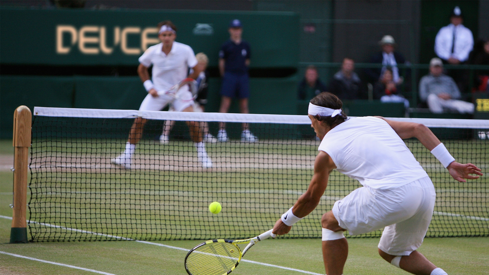
This motion montage captures the spirit of Deuce by highlighting the intense competition and the emotions of the players in contrast to the lifestyle of tennis.

Logo
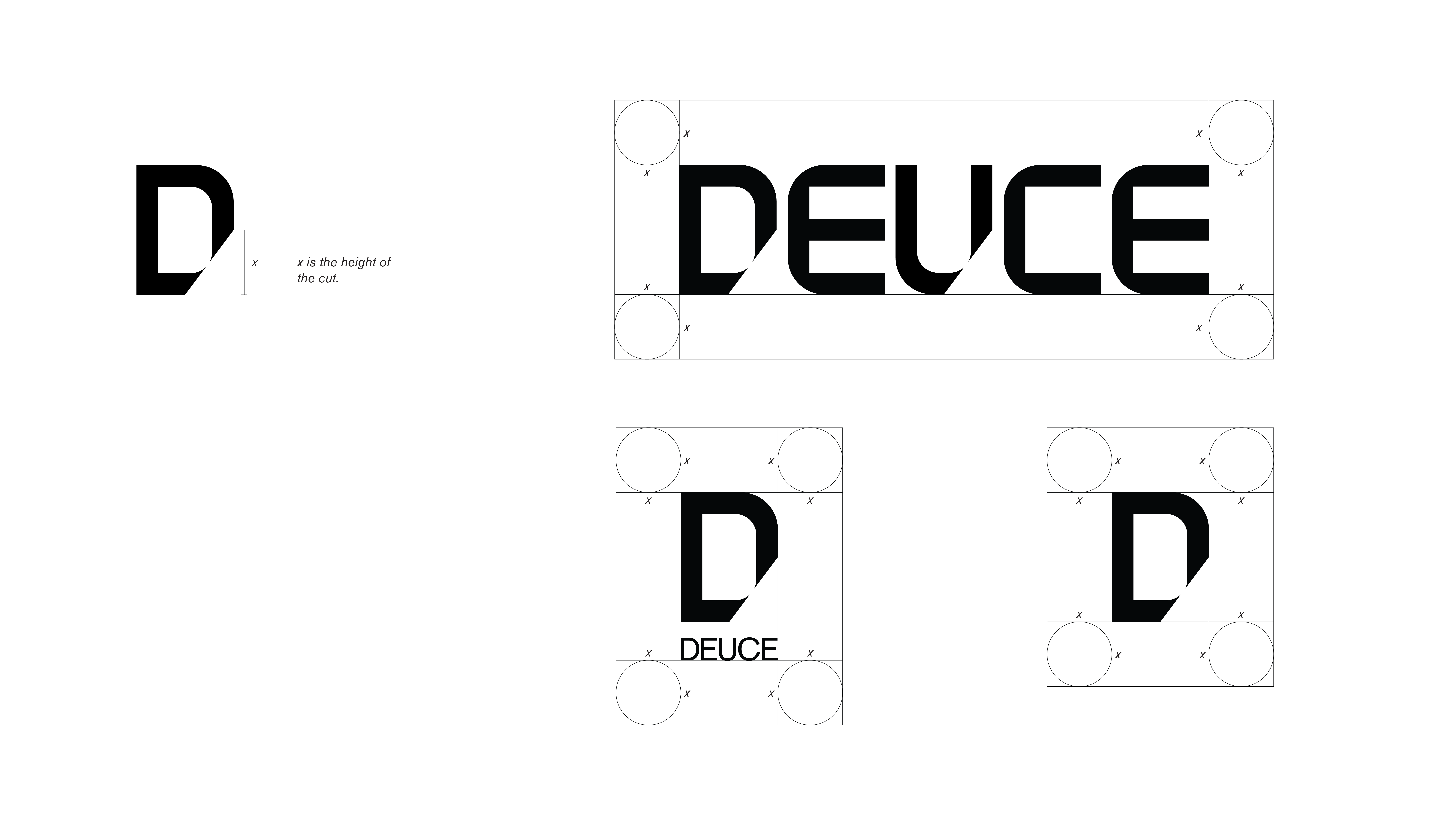
I developed this logo by using the grid in a racquet shape and making specifically measured cuts in the angle that a racquet should come in contact with a ball for the perfect hit.


A.
This series focuses on capturing the emotion that the players feel during their matches.


B.
This series emphasizes the tagline “UNTIL WE WIN” and shows the players versus the courts.


C.
This series would be used to promote tournament related content. That includes matches and tournament schedules.


D.
This series would be used to promote lifestyle related content. These would feature quotes from the players or articles on lifestyle.


Spacial
The spacial design strategy is to create an advertising "take over” in cities where the Grand Slam tournaments are held, concentrating in heavily trafficked areas in and around the event.
Web
Focusing on the Competition section of the site, it provides in-depth statistics and info about each competition.
Mobile
The app focuses on the lifestyle content that would more likely be viewed on a phone. This includes Lifestyle, a collection of articles, and Podcast and Play featuring streamable content.
Social Media
The social media campaign speaks to younger females, through Instagram. Taking advantage of the carousel feature, we use it to put emphasis on the voices of the players.
Instagram Stories
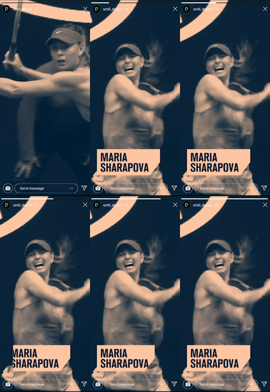
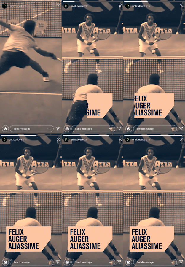
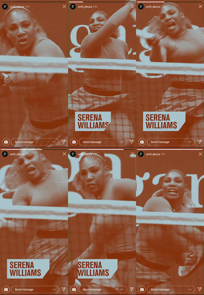
Capturing the peaks of the players’ emotions, Deuce uses the short stories to highlight key moments from their games.

Stationery
